 Skip to content




Fountain Pen vs Calligraphy Pen: The Differences Every Beginner Should Know
“Is that for calligraphy?” is a familiar question when someone sees a fountain pen. The exposed nib looks different from a ballpoint, and the writing can feel more deliberate, so the connection is understandable. But a normal fountain pen does not automatically produce thick-and-thin decorative letters.
The confusion begins because fountain pen describes an ink-delivery system, while calligraphy describes an activity and a range of tools used for it. Some calligraphy pens are fountain pens. Others are dip pens, brush pens or markers. Their tips, inks and techniques can be quite different.
At Makoba, we want beginners to buy the tool that matches the writing they actually want to make. This guide explains the distinctions, how ordinary handwriting differs from broad-edge and pointed-pen lettering, and why ink compatibility deserves as much attention as the shape of the nib.
Key highlights
- An ordinary fountain pen is primarily a handwriting instrument.
- Calligraphy can use broad-edge nibs, pointed nibs, brushes or other tools.
- Stub and italic nibs create line variation through shape, not necessarily pressure.
- A gold nib is not automatically a flexible calligraphy nib.
- Never assume calligraphy ink is safe inside a fountain pen.

What makes a fountain pen a fountain pen?
A fountain pen carries an internal ink supply and feeds liquid ink towards a nib. The reservoir may be a cartridge, converter or built-in filling system. The feed controls supply so the pen can write without being dipped repeatedly.
The ordinary rounded nib is designed for everyday writing. It can produce a fine, medium or broad line depending on the tip and conditions, but it does not necessarily create a dramatic contrast between vertical and horizontal strokes.
That makes a conventional fountain pen useful for notes, letters and journals. It can also be used creatively, but its basic identity does not promise any particular script or decorative effect.
What is a calligraphy pen?
The term covers tools chosen for a lettering technique. A broad-edge nib makes different widths through its shape and angle. A pointed flexible nib can create variation through controlled pressure. A brush responds through its fibres or synthetic tip.
Some of these tools contain an ink supply. Others are dipped into an appropriate liquid. A pen holder with a removable dip nib is therefore a different ownership system from a cartridge-filled fountain pen, even when both have exposed metal tips.
Before buying, identify the script or visual effect you want. Italic-style broad-edge letters, pointed-pen flourishes and brush lettering are not interchangeable tasks. The tool should support the technique.
Start by looking at a sample of the writing
Find an example of the lettering you would like to practise and ask what tool produced it. Look at the stroke contrast, the shapes of the letters and whether the line changes with direction or pressure.
A product called calligraphy pen may be intended for a very specific kind of mark. Buying the label without understanding the tip can leave you trying to make a pointed-pen effect with a broad-edge nib, or pressing an ordinary fountain pen too hard.
Keep the first goal small. Learning a consistent alphabet with the correct tool is more useful than collecting several pens that promise creativity in different ways.
Rounded fountain pen nibs: for ordinary writing
A rounded tip aims to provide a reasonably consistent line through normal handwriting movements. The actual width varies with the nib, ink and paper, but the instrument does not require deliberate thick downstrokes to do its job.
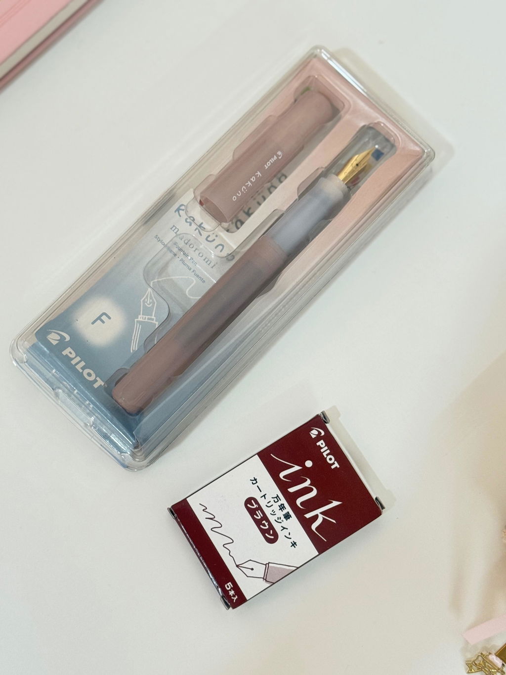
The Pilot Kakuno and conventional LAMY Safari variants are useful examples to consider for everyday writing. Their appearance may look calligraphic to a newcomer, yet their standard nib choices serve ordinary handwriting.
You can practise spacing, letterforms and neat writing with them. Those are valuable skills. They are simply different from expecting the nib itself to produce dramatic stroke contrast automatically.
Broad-edge nibs: variation through shape
A broad-edge nib has a wider writing edge. Held at an appropriate angle, it creates different widths as the direction of movement changes. The variation comes from the relationship between the edge and the stroke.
This is why the same nib can make a broad movement in one direction and a narrower movement in another without being pressed harder. Consistent angle becomes part of the technique.
For a beginner interested in italic or related broad-edge styles, this can be an accessible route. The main skill is controlled movement and orientation, not force. Choose the width around your planned letter size and practice paper.
Stub and italic are related, not identical
A stub generally offers a broader writing edge with more forgiving corners, while sharper italic designs can demand more precise contact. Specific nibs differ, so the name alone does not tell you exactly how forgiving a particular product will feel.
A stub can be enjoyable for everyday handwriting as well as introductory lettering. A sharper specialist nib may be better suited to deliberate practice than hurried notes.
Our nib guide explains the wider categories. Choose around the desired result rather than assuming a larger number always means a better calligraphy tool.
Pointed flexible nibs: variation through controlled pressure
Pointed-pen calligraphy uses a different principle. An appropriate flexible nib changes its stroke as pressure is controlled within its intended range. This technique belongs to a suitable tool and requires learning the correct movement.
Do not copy the pressure shown in a pointed-pen demonstration with a normal fountain pen. The ordinary nib may not be designed to flex safely. Damage can occur before the writing looks anything like the example.
If pointed-pen work is your goal, choose a tool specifically intended for it and follow a suitable learning method. A general fountain pen purchase is not a shortcut around that distinction.
Gold does not mean flexible
Gold content describes the nib material. It does not establish how far the nib may safely bend or whether it is intended for calligraphic pressure variation.
Likewise, a large exposed nib is not automatically a flex nib. Size, appearance and price can all mislead when the actual intended use is not checked.
Ask for the maker's description of the exact nib. If flex capability is not part of its intended design, use normal light fountain pen pressure instead of testing how far the metal will move.
Brush pens and markers belong to another branch
A brush pen can create expressive variation through the behaviour of its tip. It may suit modern brush lettering or other styles, but it does not behave like a broad-edge metal nib.
Markers with shaped tips can also be used for lettering. Their convenience can make them a useful way to explore a style, although the feel and line quality differ from liquid ink delivered through a metal nib.
The point is to choose deliberately. Calligraphy is not restricted to one tool, and buying a fountain pen is not a requirement for learning every form of lettering.
Fountain-style calligraphy pens
Some pens combine a broad-edge writing tip with an internal supply. This can make practice convenient because you can write for longer without repeated dipping. It still requires the appropriate ink and operating routine.
Our LAMY Joy Black is one relevant catalogue direction. Check the exact nib width and package contents before choosing. A single pen and a set with multiple parts are different purchases.
This type of instrument can be useful when your interest is broad-edge writing and you prefer a self-contained pen. It should not be described as a universal replacement for pointed dip pens or brushes.
Pilot Parallel: understand the intended system
Pilot's Parallel is another example of a lettering-focused instrument with a distinctive plate-style tip. The width and design create a specific writing experience that differs from a conventional rounded fountain pen nib.
Use the maker's specified supplies and care instructions. Do not assume every Pilot ink product is intended for every Pilot pen merely because the brand is shared. The same caution applies to transferring specialist liquids into other instruments.
If the Parallel is the tool you are considering, identify the desired letter size and width first. A very broad tip can be enjoyable for larger lettering while being impractical for ordinary notebook paragraphs.
Ink compatibility: the mistake worth avoiding
Some calligraphy and drawing inks contain binders or other ingredients designed for dip pens, brushes or particular surfaces. Those products may not be suitable for a fountain pen feed and reservoir.
The word ink is not enough. Check whether the bottle explicitly states that it is appropriate for the exact type of instrument you will use. A beautiful colour does not make an unsuitable formula safe for a fountain pen.
Our fountain pen ink range is a useful starting category for fountain-style instruments. For a specialist lettering tool, follow its specific supply guidance rather than improvising from a general ink label.
Do not judge compatibility from thickness alone
A liquid that looks thin can still contain unsuitable ingredients. A product labelled waterproof may use a formula with particular handling requirements. Visual inspection does not establish how it will behave inside a feed.
Likewise, not every pigment-based ink belongs in the same category. Some are formulated specifically for fountain pens and others are not. The product's intended use matters more than a single ingredient word.
If the label or instructions are unclear, ask before filling. It is much easier to choose the correct bottle than to remove dried residue from an unsuitable system later.
Paper for practice
Choose a surface that supports clear edges and comfortable contact with the tip. Paper that feathers heavily can obscure letterforms and make it difficult to judge whether a stroke is controlled.
For broad-edge practice, allow enough page space for the intended letter height. A very wide nib on narrow ruling is an awkward combination. Guidelines can help you learn proportion without requiring a decorative notebook layout.
Browse our fountain pen friendly notebooks for suitable writing options, but check the exact ink and technique. A paper that works for ordinary handwriting does not automatically suit every heavy calligraphic application.
Line variation is not the same as shading
Line variation describes changes in stroke width. Shading describes lighter and darker areas of the ink colour. A rounded fountain pen can show shading without producing broad-edge calligraphy.
Sheen and shimmer add other visual effects, but they do not turn an unsuitable nib into the right lettering tool. The writing shape and the ink appearance are related parts of a page, not the same property.
Our shimmer, sheen and shading guide explains those effects. Choose the writing tool first, then consider the ink behaviour appropriate to it.
Which should you buy for better everyday handwriting?
If your goal is clearer notes and more comfortable ordinary writing, begin with an appropriate everyday pen. Practise consistent letter height, spacing and a relaxed grip. A calligraphy nib is not required for those improvements.
A fountain pen may encourage lighter pressure and more attention, but it will not redesign your handwriting automatically. The benefit comes through how you use it.
Our handwriting improvement article discusses the distinction. Buy a specialist calligraphy tool when the goal is a particular lettering technique, not because the word sounds like a promise of instant neatness.
Which should you buy for creative lettering?
Choose from the sample you want to produce. For broad-edge letters, shortlist an appropriate broad-edge or stub/italic instrument. For pointed-pen contrast, choose a tool explicitly intended for that technique. For brush lettering, consider a suitable brush system.
Keep the first purchase manageable: one tool, the correct ink and enough suitable practice paper. Several widths and accessories can be added after you understand what limits the first setup.
The aim is to practise a method consistently. Switching tools every few minutes can make it difficult to distinguish a technique problem from the ordinary differences between tips.
A simple first practice session
Begin with basic strokes rather than a finished quotation. Observe the width created by direction and angle. Keep pressure within the tool's intended use and move slowly enough to notice what changes.
Then practise a small group of letters with related shapes. Leave room to compare them. A page of thoughtful repetition can teach more than one elaborate word copied without understanding its construction.
Date the sheet and record the tool, width, ink and paper. Those notes make the next session easier to compare. You do not need a perfect page; you need evidence of what your hand and tool are doing.
Common beginner mistakes
The most damaging mistake is pressing an ordinary fountain pen as though it were a suitable flex tool. Another is putting an incompatible calligraphy ink into a fountain-style reservoir. Both come from treating all nibbed pens as interchangeable.
Less damaging but frustrating mistakes include choosing a tip too broad for the practice space, comparing writing at different sizes and using paper that feathers enough to hide the edges.
Finally, do not judge progress against a polished final piece without seeing the practice behind it. The tool matters, but so do repetition, proportion and the time spent learning the intended movement.
What about left-handed calligraphy?
Left-handed users can practise lettering, but hand position and pen angle deserve specific attention. Broad-edge and pointed-pen techniques have different requirements, so ordinary handwriting advice should not be transferred unchanged.
Choose guidance for the tool and script, and keep the posture comfortable. Drying and paper contact may also matter depending on where your hand travels.
Our left-handed fountain pen guide offers a starting discussion of hand position. For a specialist lettering style, build on it with method-specific instruction rather than forcing an uncomfortable imitation.
Caring for the tool you choose
Follow the instructions for both the instrument and ink. A dip nib, brush and fountain pen can have different cleaning requirements. Do not apply one routine to all of them simply because the marks look similar.
For fountain pens, cap during breaks and clean before appropriate changes or storage. Avoid unnecessary disassembly. Our cleaning guide explains ordinary care, while specialist tools should follow their own directions.
Good care keeps practice predictable. A dried or poorly supplied tip can make you think the technique is wrong when the tool simply needs the correct maintenance.

A broad-edge beginner's example
Suppose the writing you admire has broad vertical movements and narrow horizontal strokes, with consistent letter proportions. Before purchasing, establish whether it is a broad-edge style and identify a suitable learning method. A stub or italic fountain-style instrument may be relevant, but the choice should follow the intended technique.
Choose a manageable tip width and enough paper space. Write a few straight strokes while keeping the nib angle consistent, then compare changes of direction without adding pressure. This helps you see what the edge itself produces. Only then begin combining strokes into letters.
If the corners catch, check angle, paper and the specific nib design. Do not immediately bend the tines or assume a sharper instrument will be easier. A forgiving practice tool can be more useful than a technically impressive tip that demands control you are still learning.
A pointed-pen beginner's example
Suppose the sample instead shows flowing connections and pressure-shaped contrast. A conventional fountain pen is unlikely to reproduce it simply by being held more carefully. Identify an appropriate pointed-pen tool and instructions before trying to imitate the movement.
The ink must match that tool. A dip-pen formula can be suitable for the chosen dip nib while remaining inappropriate for the reservoir pen already on your desk. Keep the supplies clearly identified so practice does not lead to an accidental fill with the wrong bottle.
Practise within the intended pressure range and follow the learning method. The visual effect comes from the tool and technique together. Buying a pen described as premium does not remove the need to learn how the stroke is constructed.
Keep creative practice separate from everyday requirements
You may enjoy a specialist nib at home and prefer a conventional pen for hurried notes. That is a sensible distinction. A tool chosen for deliberate letterforms does not need to become the only instrument you use.
Keeping the roles clear also helps with paper and ink. Your practice pad may tolerate a technique that an office form does not. Your favourite journal ink may be delightful for ordinary handwriting without being the right choice for a particular lettering system.
If you want one pen to cover several purposes, explain the compromise. A forgiving stub can be a useful option for some users, while others will prefer separate instruments. The best recommendation acknowledges the tasks rather than promising that one nib will excel at everything.
Choosing a gift for someone interested in calligraphy
Ask which style they want to learn and whether they already have a tool. A beginner broad-edge set and a pointed-pen setup answer different interests. If you cannot identify the style, a conversation or a clear sample is more useful than guessing from the word calligraphy.
Include the correct ink and an appropriate practice surface where possible. A beautiful instrument without compatible supplies creates a delayed first-use experience. The thoughtfulness lies in giving the recipient a coherent way to begin, with instructions that match the actual tool.
Our verdict: choose the effect before the instrument
For ordinary handwriting, choose a comfortable fountain pen with an appropriate rounded nib. For calligraphy, identify the style and choose the tool designed to produce it. Some of those tools are fountain pens, but many are not.
At Makoba, show us the kind of writing you want to make and tell us whether you prefer cartridges, bottled ink or a dip system. We can help narrow the available options and compatible essentials. The right first purchase should give your practice a clear direction instead of asking one pen to perform every technique.
Frequently asked questions
Can I use a normal fountain pen for calligraphy practice?
You can practise letterforms and spacing, but a standard rounded nib will not automatically produce broad-edge or flex-style contrast. Choose a specialist tip for the intended effect.
Is a stub nib a flex nib?
No. A stub creates variation through its broad shape and direction. Flex variation relies on a suitable nib's intended response to controlled pressure.
Can I fill a fountain pen with any calligraphy ink?
No. Use only a formula explicitly suitable for the instrument. Some calligraphy inks are intended for dip pens or brushes and can be inappropriate for fountain pen feeds.
What is the best beginner purchase?
The answer depends on the writing goal. Choose an everyday fountain pen for notes, or a suitable lettering tool for a specific style, with the correct ink and paper alongside it.
Manufacturer and method references
Pilot fine-writing and Parallel guide, LAMY converter compatibility.


Leave a comment