 Skip to content
Why German, Japanese, and Italian Pens Feel So Different When You Write? A deep educational guide for writers, professionals, and collectors
Introduction: Why Two Fountain Pens Never Feel the Same
Pick up two luxury fountain pens of similar size and price, fill them with the same ink, and write on the same paper—and yet, they can feel completely different. One glides effortlessly, another offers tactile feedback, a third feels expressive and alive under pressure. This difference is not accidental. It comes from national design philosophy, nib engineering, cultural writing traditions, and manufacturing priorities.
German, Japanese, and Italian fountain pens represent three of the most respected schools of pen-making in the world. Each country approaches writing as a craft in its own way. Understanding these differences helps writers choose the right pen for daily notes, long journaling sessions, executive signatures, or creative expression.
This guide explains why German, Japanese, and Italian pens feel different, explores famous models, compares nib sizes (EF, F, M, B), and provides clear tabular comparisons so readers can make confident decisions.
What Actually Determines “Writing Feel” in a Fountain Pen
Before comparing countries, it’s important to understand what creates writing feel.
Key factors that influence writing experience
- Nib tipping size and grind shape
- Nib material (steel, 14k gold, 18k gold, 21k gold)
- Nib stiffness vs springiness
- Ink flow (dry, balanced, wet)
- Feed design and ink delivery system
- Pen weight, balance, and grip section
- Paper interaction (absorbent vs coated paper)
Each pen-making culture prioritizes these factors differently.


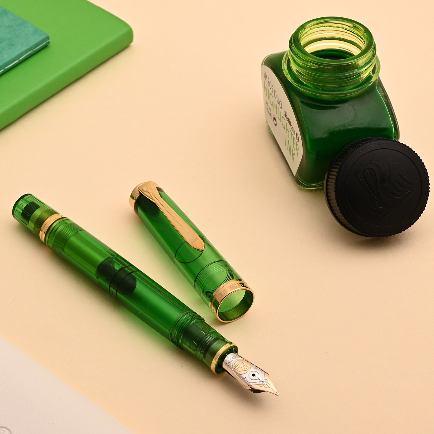
German Fountain Pens: Precision, Engineering, and Confident Smoothness
German fountain pens are built with an engineering-first mindset. They emphasize consistency, durability, and controlled smoothness, making them highly reliable tools for professionals and long-term use.
Major German pen brands
Famous German models and their character
- Montblanc Meisterstück 149 / 146 – Large, authoritative pens with smooth, generous nibs designed for signatures and executive writing
- Pelikan Souverän M800 / M1000 – Piston fillers with large ink capacity, slightly springy gold nibs, ideal for long writing sessions
- Lamy 2000 – Bauhaus design, hooded nib, practical daily writer with excellent balance
- Graf von Faber-Castell Classic – Luxury materials with conservative, extremely refined nib tuning
- Diplomat Excellence – Crisp nibs, excellent sealing cap, strong daily-use reliability
How German nibs typically write
German nibs are usually wider and wetter than Japanese nibs of the same size. They feel smooth but substantial, often described as “confident” on paper.
Typical German nib behaviour
- EF: Fine but not needle-like, slightly broader than Japanese EF
- F: Balanced everyday width, smooth with light feedback
- M: Rich, smooth, excellent for cursive writing
- B: Bold, wet, signature-focused
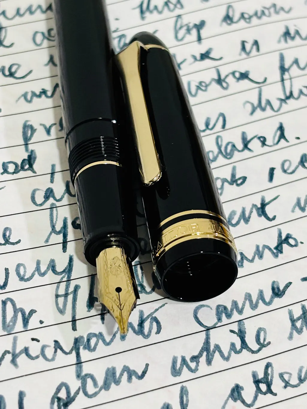
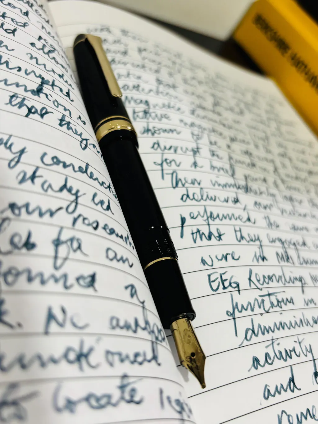
Japanese Fountain Pens: Precision, Fineness, and Perfect Control
Japanese pens are admired worldwide for their extraordinary nib precision and consistency. They are designed for detailed handwriting, kanji characters, and long writing sessions requiring control rather than weight.
Major Japanese pen brands
Famous Japanese models and their character
- Pilot Custom 823 – Vacuum filler, smooth nib, slightly wetter than most Japanese pens
- Pilot Vanishing Point (Capless) – Retractable nib, perfect for quick notes and professionals on the move
- Sailor 1911 & Pro Gear – Famous for ultra-precise nibs with controlled feedback
- Platinum #3776 Century – Firm nibs, exceptional cap seal that prevents ink drying
![]()

How Japanese nibs typically write
Japanese nibs are finer and more controlled than Western nibs. They are ideal for small handwriting and clean note-taking.
Typical Japanese nib behaviour
- EF: Extremely fine, needle-like precision
- F: Crisp and controlled, excellent for planners
- M: Comparable to a Western Fine
- B: Still controlled, less wet than European Broad
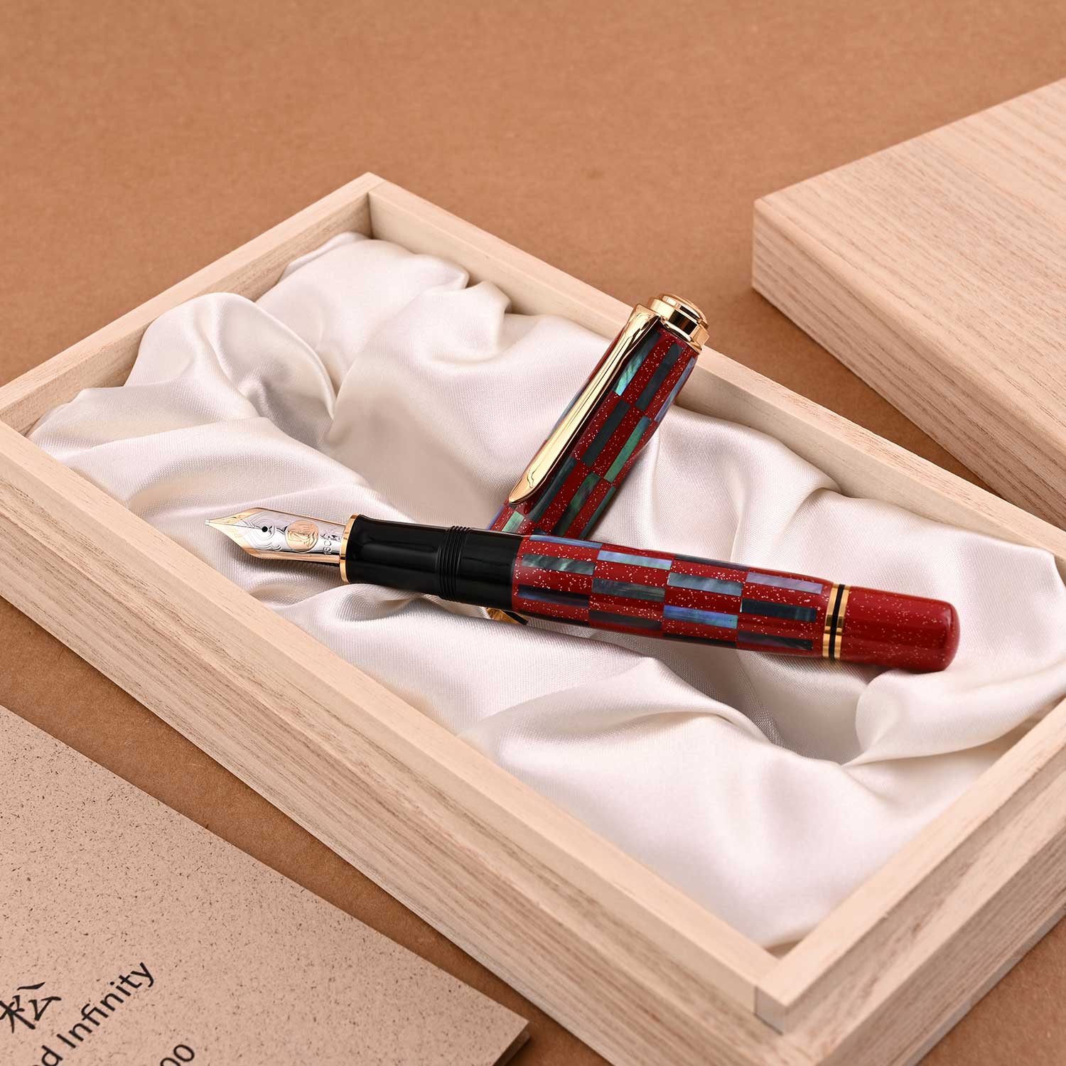
Italian Fountain Pens: Expression, Emotion, and Artistry
Italian fountain pens celebrate writing as an emotional and visual experience. They are known for expressive nibs, bold designs, and hand-finished character.
Major Italian pen brands
Famous Italian models and their character
- Aurora 88 / Optima – Warm, slightly springy nibs with expressive flow
- Leonardo Momento Zero – Hand-finished feel with balanced weight
- Montegrappa Extra – Bold aesthetics, wet and luxurious nibs
- Delta Dolcevita – Iconic design with character-rich nib performance


How Italian nibs typically write
Italian nibs often feel livelier and wetter, offering character rather than strict precision.
Typical Italian nib behaviour
- EF: Fine but expressive, slightly broader than Japanese EF
- F: Smooth, rounded stroke
- M: Lively and wet, excellent shading
- B: Very bold, signature-focused
Nib Size Comparison Table (EF, F, M, B)
|
Nib Size |
Japanese Feel |
German Feel |
Italian Feel |
|
EF |
Ultra-fine, precise, controlled |
Fine but slightly broader |
Fine with warmth |
|
F |
Crisp, compact writing |
Smooth everyday width |
Rounded, expressive |
|
M |
Comparable to Western F |
Rich and smooth |
Wet and lively |
|
B |
Controlled broad |
Bold and saturated |
Very bold, expressive |
Ink Flow & Writing Character Comparison
|
Feature |
Japanese Pens |
German Pens |
Italian Pens |
|
Ink Flow |
Controlled to moderate |
Moderate to wet |
Wet |
|
Feedback |
Glassy, precise |
Smooth with substance |
Smooth with character |
|
Line Variation |
Minimal |
Moderate |
High |
|
Shading |
Subtle |
Good |
Excellent |
|
Paper Sensitivity |
Works on thin paper |
Needs decent paper |
Best on premium paper |
Which Pen Style Suits Which Writer?
Everyday notes and planners
Best choice: Japanese EF or F
Reason: Clean lines, minimal bleed-through
Long journaling sessions
Best choice: German M or Italian M
Reason: Comfortable flow and balance
Executive signatures
Best choice: German B or Italian B
Reason: Authority, boldness, presence
Expressive handwriting and shading
Best choice: Italian M or B
Reason: Wet flow and lively nib response
Why the Same Nib Size Feels Different Across Countries
Even when labelled the same, nib sizes differ because:
- Japanese tipping is ground smaller
- German tipping is rounder and more smooth
- Italian nibs often have softer geometry
- Feed systems are tuned differently
- Cultural writing habits influence design
A Japanese Medium often writes like a German Fine. An Italian Broad often writes wider than a German Broad.
Summary Comparison Table
|
Aspect |
Japanese |
German |
Italian |
|
Precision |
Very High |
High |
Moderate |
|
Expressiveness |
Low |
Medium |
High |
|
Nib Consistency |
Excellent |
Excellent |
Variable (artisan) |
|
Best For |
Small handwriting, notes |
Professional use |
Signatures, flair |
|
Writing Feel |
Controlled, refined |
Confident, smooth |
Lively, emotional |
Why Buy These Pens from Makoba
Makoba is India’s trusted destination for luxury writing instruments.
What Makoba offers
- 100% authentic German, Japanese, and Italian pens
- Curated nib options suitable for Indian writers
- Expert guidance on nib sizes and writing styles
- In-store testing and professional advice
- Premium presentation for gifting
- Reliable after-sales support
Choosing the right pen is not about price—it’s about matching the nib personality to your handwriting and purpose. Makoba helps you do exactly that.
Final Thoughts
German, Japanese, and Italian fountain pens are not competing—they are complementary.
- Japanese pens excel at precision and discipline
- German pens deliver confidence and reliability
- Italian pens bring emotion and expression
The best writers often own one from each tradition. When you understand how nib sizes and flow differ across countries, you stop guessing—and start choosing with clarity.
A pen should not just write.
It should feel right in your hand.


Leave a comment